COMP · Composition
Rule of Thirds: The Grid That Makes Photos Instantly Better
The rule of thirds is the fastest way to turn a flat snapshot into a balanced, intentional photograph. Here is how to actually use it in the field.
Diagrams
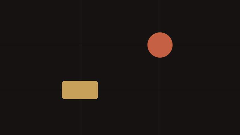
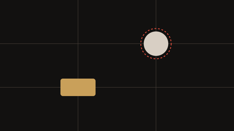
Most cameras and phones can overlay a 3x3 grid on the screen or viewfinder. The rule of thirds says you place your key subject on one of those lines, or better, at one of the four points where the lines intersect. Those intersections are the strongest spots because the eye drifts there naturally instead of to the dead centre. Turn the grid on in your camera menu, leave it on for a month, and use it until you stop noticing it. The goal is not to obey it forever but to train your eye to see the frame as nine zones instead of one empty rectangle.
In practice the rule governs two decisions: where the horizon sits, and where the subject sits. The sections below take each of them apart, cover the mistakes that make a thirds composition look accidental, and explain when a centred frame is the stronger answer.
Why the Intersections Are the Strongest Points
A subject on a third line is already better placed than one in the dead centre, but the four intersections are stronger still, because two lines agree on the same spot and the eye is pulled there twice. In practice that means a portrait subject's near eye, a boat on a lake or a lone tree on a ridge usually reads best sitting on one of those four points.
Build one habit before you raise the camera: decide which intersection your subject will occupy, and whether the horizon will run along a third line or through the middle. Two decisions taken early stop you from hunting through the frame at the last second.
Treat the lines as guides rather than rails. A subject a centimetre off an intersection still reads as deliberate; a subject halfway between the centre and a line reads as an accident. Aim for the intersection and let your hand be approximate.
Placing the Horizon, High or Low
The horizon is the one line almost every outdoor photograph has, and it decides how the frame balances. Instead of bisecting the picture, push it to the upper or lower third. Place it low when the sky is dull and the foreground carries the texture; place it high when the clouds are dramatic, when the light lives in the sky, or when a reflection needs room.
A horizon on a third still has to be level. Use the electronic level, a hot-shoe bubble level or the grid itself and check before you release the shutter. A one-degree tilt is the fastest way to make an otherwise deliberate composition look careless, and it is easy to miss on a small rear screen.
Through the middle is not forbidden, only deliberate. A symmetrical reflection, a mirrored facade or a minimalist seascape often wants the horizon dead centre, because there the symmetry itself is the subject.
Giving the Subject Room to Look Into and Move Into
Slide the main subject off-centre so it has somewhere to go. A runner, a cyclist or an animal should have more space ahead of it than behind, so the frame reads as movement rather than as an object that has stopped. A person looking to one side needs space on the side they are looking toward; crop tight behind the head and the picture feels trapped.
Where the subject sits relative to the light matters just as much. If a bright patch, a window or the sun sits opposite your subject, the eye is pulled away from what you want it to see. Move, wait or reframe until the brightest area supports the subject instead of competing with it.
When nothing lands on a third line, move your feet: step sideways, tilt, kneel or climb. Zooming only changes the crop. Walking changes the relationship between subject and background, and that relationship is usually the thing that was wrong.
The Halfway Trap and Other Common Failures
The most frequent mistake is applying the rule halfway, so the subject ends up between the centre and the third line. It looks accidental rather than composed. Either commit to the third or commit to the centre.
The second is a dead, empty remainder. If the other two thirds carry nothing at all, the picture is simply unbalanced rather than dynamic. Fill the rest of the frame with something that supports the subject, even if that something is only tone and gradient.
The third is a bright distraction opposite the subject. Check the whole frame before you shoot, not just the area around your subject, and remember that a photograph taken slightly loose can often be cropped later to move the subject onto a third line.
When the Centre Is the Better Answer
The rule of thirds is a default, not a law. Symmetry, reflections, minimalist portraits and many architectural frames work best dead centre, where a centred subject backed by strong symmetry reads as deliberate and powerful. Subjects with their own radial energy suit it too: a tunnel, a spiral staircase seen head-on, a portrait where the eyes are the entire point.
A useful test is to ask whether the frame is interesting without the rule. If it is, break the rule and let the geometry speak. If the frame is only interesting because of where the subject sits, the rule is doing real work and you should keep it.
Shooting a scene both ways costs a few seconds and is the fastest experiment available: the comparison teaches you more about your own eye than any diagram.
Key points
- Place your main subject on a third line or, better, on one of the four intersections.
- Push the horizon to the upper or lower third, then level it with the grid.
- Move your feet instead of zooming - a new position changes the background too.
- Avoid the halfway trap: commit to either the third or the dead center.
Frequently asked questions
- Is the rule of thirds the same as the golden ratio?
They are related but not identical. The golden ratio places its dividing lines closer to the centre, at roughly 38 and 62 percent across the frame, rather than at 33 and 67 percent. The difference is subtle and mostly academic in the field, because both exist to keep a subject from sitting statically in the middle. Most photographers learn the thirds first, because a camera grid can display them, then notice that some compositions look better slightly closer to the centre.
- Should I leave the grid switched on permanently?
Many photographers do. Leaving it on for a month is the quickest way to build the habit of seeing the frame in zones, and afterwards it costs nothing to keep. If you notice the lines dictating every frame, switch the grid off for a few weeks and compose by eye, then check on the rear screen. The grid should be a training aid, not a crutch.
- Does the rule apply to vertical video and square crops?
The thirds divide whatever shape you are shooting, so in a 9:16 vertical frame the lines fall much closer to the centre in absolute terms, and a vertical composition can tolerate a slightly more central subject. When one shoot has to serve several crops, place the subject near the upper middle and fine-tune each crop separately afterwards.
- How does it apply to a tight headshot?
Loosely. In a tight portrait the useful part of the rule is vertical: the eyes usually sit near the upper third line. Lateral placement matters less because the face fills the frame. What matters more in a headshot is the space above the head, where a sliver of background generally looks more confident than a large empty gap.